What a Great Coaching or Therapy Website Actually Looks Like
You've seen websites that instantly make you think "wow, they're the real deal," and others that make you quietly click away. What's the difference? It's almost never luck, and it's not just prettiness.
If you've ever looked at your own coaching or therapy website and thought "something's missing, but I can't name it," this post is for you. I'll walk you through what a great coaching or therapy website actually looks like, the specific traits that make a site feel trustworthy, clear, and ready to book clients, so you can spot exactly what yours is doing well and where it could be stronger.
The short answer? A great coaching or therapy website is clear within seconds, speaks directly to its ideal client, builds trust through story and proof, makes booking effortless, and feels cohesive and calm on every device. It's not about flashy design, it's about a site that guides the right person smoothly from "just looking" to "I want to work with her." Let's look at what that means in practice.
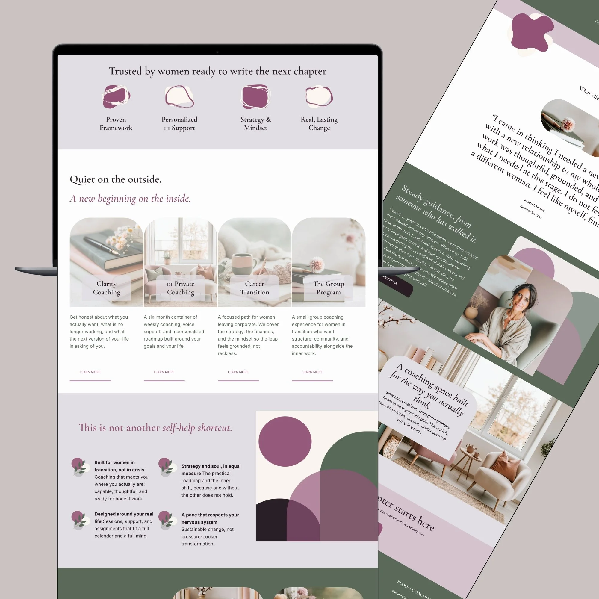
What Makes a Coaching Website Feel Trustworthy Right Away?
A great site earns trust in the first few seconds through clarity and a calm, cohesive look. The moment someone lands, they instantly understand who you help and feel a sense of professionalism and warmth, which tells them they're in safe, capable hands.
Picture landing on a coach's homepage where the very first thing you see is a clear line like "I help overwhelmed moms rebuild their confidence," a warm, real photo, and one obvious button that says "Book a free call." Within three seconds, you know exactly who it's for, what she does, and what to do next. That instant clarity is the foundation of trust.
Now picture the opposite: a moody image, a vague tagline like "Begin your journey," and no clear direction. Even if it's beautiful, you hesitate. A great website removes that hesitation immediately. This is the 3-second homepage rule in action, and it's the single biggest thing separating sites that book from sites that don't.
How Does a Great Website Connect With the Right Client?
It speaks directly to one specific person, not everyone. A great coaching or therapy website uses language that makes the ideal client feel seen, so she thinks "this is exactly what I need" instead of wondering whether she's in the right place.
The best sites feel like they're reading the visitor's mind. Instead of listing services in clinical terms, they name what she's actually feeling: "Tired of feeling anxious every Sunday night?" or "Ready to stop second-guessing every decision?" That kind of language creates an instant "yes, that's me" moment.
This shows up everywhere on a great site, but especially on the About page, which is often the second most-visited page. A strong About page doesn't open with credentials, it opens with her, then bridges into your story and why you do this work. If you want the full breakdown, I covered it in how to structure an About page that turns visitors into clients. The whole site should feel like a warm conversation with exactly the right person.
What Does a Great Website Do to Build Trust?
It layers in proof and warmth: testimonials, a relatable story, clear offers, and an easy way to get in touch. These trust signals reassure a nervous visitor that you're experienced, safe, and worth reaching out to.
Here's what the best coaching and therapy sites include to build trust:
● Testimonials placed where decisions happen, right near the calls to action, not hidden on a separate page.
● A real, warm About page that helps her see herself in your story and feel a connection before she books.
● Clear offers and next steps, so she never has to guess what you do or how to start.
● Easy, visible contact and booking, so reaching out feels simple and low-pressure.
● A cohesive brand (consistent colors, fonts, and voice) that makes everything feel established and intentional.
When these are missing, even a pretty site quietly loses people, which is exactly what I dug into in why your beautiful website isn't booking clients. A great site makes trust feel effortless.
What Does a Great Website Make Easy?
It makes taking the next step effortless. Booking a call, grabbing a freebie, or reaching out should be obvious and simple on every page, so an interested visitor never has to hunt for how to work with you.
A great coaching or therapy website is built around one clear journey: land, understand, trust, act. Every page gently points toward a single next step, usually booking a call or opting in for a freebie. There's no clutter, no maze, no dead ends. Just a smooth path forward.
It also feels great on a phone, since that's where most people meet you first, often through a link in bio. The buttons are easy to tap, the text is easy to read, and nothing feels cramped. And it loads quickly, because a beautiful site that's slow still loses people. All of this rests on having the right pages doing the right jobs, which I laid out in what pages a coaching or therapy website actually needs.
Is Great Design Enough on Its Own?
No. Great design is the visible layer, but strategy is what makes it work. The most effective coaching and therapy websites pair a beautiful look with intentional structure, clear messaging, and a smart client journey underneath.
This is the piece people miss. When you look at a website that just works, it's tempting to credit the pretty design. But what you're really responding to is the strategy underneath: the clear message, the smart page order, the trust signals in the right places, the obvious next step. The design makes it feel good. The strategy makes it convert.
That's also why grabbing a nice template and filling it in doesn't automatically get you here. The template is the look, you still have to add the strategy, which I explained in why a template alone won't solve your website problem. A truly great site is design and strategy working together, and that combination is exactly what I build for coaches and therapists. You can see real examples in my portfolio.
Quick Recap: What a Great Website Looks Like
● Clear in seconds: who you help and what to do next, right away
● Speaks to one person: language that makes her feel seen
● Builds trust: testimonials, a warm About page, clear offers
● Makes action easy: simple booking, mobile-friendly, fast
● Design plus strategy: beautiful on top, intentional underneath
Your Website Can Look Like This Too
Here's the encouraging part. A great coaching or therapy website isn't reserved for people with huge budgets or design skills. It comes down to a handful of intentional choices: clarity, connection, trust, an easy next step, and a cohesive look. Once you know what to look for, you can spot exactly where yours is strong and where it could grow.
So this week, open your website and honestly ask: within three seconds, is it clear who I help and what to do next? That one question points you straight to your highest-impact improvement.
And if you'd love a website that checks every one of these boxes, take a look at real examples in my portfolio, explore the ways we can work together, or book a free 15-minute call. We'll figure out how to make your site one of the ones that makes people think "she's the real deal."
Frequently Asked Questions
-
Yes! You can see real coaching and therapy websites I've built in my portfolio. If you see a style you love, book a free call and we can talk about creating something similar for you.
Also, all of my templates I have created so you can view those here.
-
That's completely normal, and it usually means a few targeted tweaks, not a full rebuild. My post on why your beautiful website isn't booking clients helps you spot the gaps, and a quick call can help you prioritize what to improve first.
-
Not necessarily. A strategically built template can absolutely hit these marks, especially with the right customization. Browse my template store, or read why a template alone won't solve your website problem so you know what to pair it with.
-
Yes. A cohesive brand is a big part of what makes a great site feel trustworthy. I offer branding alongside website design, so your look and your site feel like one polished whole.
-
Yes. Beyond design, I offer ongoing backend support to keep your site updated and running smoothly, so one person who knows your business handles it all. Here's more on why that hybrid model works so well.